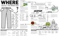
27 Visualizations and Infographics to Understand the Financial Crisis
I've said it before, and I'll say it again. If there's anything good that has come out of the financial crisis it's the slew of high-quality graphics to help us understand what's going on. Some visualizations attempt to explain it all while others focus on affected business. Others concentrate on how we, as citizens are affected. Some show those who are responsible. After you examine these 27 visualizations and infographics, no doubt you'll have a pretty good idea about what's going on.

